Quick start (Python API)
[1]:
import admix
import numpy as np
import matplotlib.pyplot as plt
from os.path import join
[2]:
dset_dir = admix.dataset.get_test_data_dir()
[3]:
dset_admix = admix.io.read_dataset(join(dset_dir, "toy-admix"))
dset_all = admix.io.read_dataset(join(dset_dir, "toy-all"))
[4]:
dset_all
[4]:
admix.Dataset object with n_snp x n_indiv = 1834 x 268, no local ancestry
        snp: 'CHROM', 'POS', 'REF', 'ALT'
        indiv: 'PAT', 'MAT', 'SEX', 'SuperPop', 'Population'
[5]:
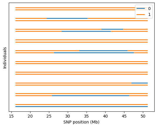
admix.plot.lanc(dset=dset_admix)
/home/runner/work/admix-kit/admix-kit/admix/plot/_plot.py:345: UserWarning: Only the first 10 are plotted. To plot more individuals, increase `max_indiv`
  warnings.warn(
[6]:
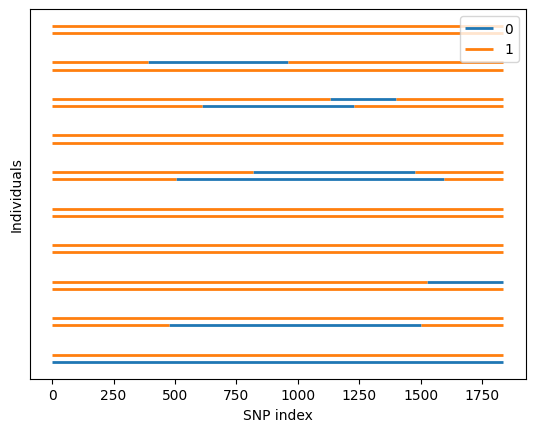
admix.plot.lanc(lanc=dset_admix.lanc.compute())
[7]:
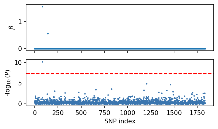
# Now we simulate phenotype for these admixed individuals.
np.random.seed(1234)
sim = admix.simulate.quant_pheno(dset=dset_admix, hsq=0.5, n_causal=2, n_sim=2)
beta, pheno_g, pheno = sim["beta"], sim["pheno_g"], sim["pheno"]
print(beta.shape)  # (n_snp, n_anc, n_sim)
print(pheno_g.shape)  # (n_indiv, n_sim)
print(pheno.shape)  # (n_indiv, n_sim)
admix.simulate.quant_pheno: 100%|██████████| 2/2 [00:00<00:00, 213.76it/s]
(1834, 2, 2)
(61, 2)
(61, 2)
[8]:
sim_i = 1
sim_pheno = pheno[:, sim_i]
sim_beta = beta[:, :, sim_i]
df_assoc = admix.assoc.marginal(
    dset=dset_admix,
    pheno=sim_pheno,
    method="ATT",
    family="linear",
)
admix.assoc.marginal: 100%|██████████| 2/2 [00:00<00:00, 143.39it/s]
[9]:
df_assoc
[9]:
| G_BETA | G_SE | N | P | |
|---|---|---|---|---|
| snp | ||||
| rs148050615 | 0.454393 | 0.573420 | 61 | 0.431287 |
| rs12160291 | -1.296505 | 1.110985 | 61 | 0.247910 |
| rs200031263 | 0.399336 | 0.268912 | 61 | 0.142865 |
| rs148779243 | -0.025490 | 0.191752 | 61 | 0.894700 |
| rs5746279 | -0.271912 | 0.258380 | 61 | 0.296920 |
| ... | ... | ... | ... | ... |
| rs12166626 | 1.509744 | 0.481625 | 61 | 0.002680 |
| rs5770995 | -0.159861 | 0.204451 | 61 | 0.437397 |
| rs113267916 | 0.329944 | 0.574861 | 61 | 0.568180 |
| rs575582761 | 0.254872 | 0.659044 | 61 | 0.700348 |
| rs9616974 | -0.122896 | 0.358607 | 61 | 0.733038 |
1834 rows × 4 columns
[10]:
fig, axes = plt.subplots(nrows=2, figsize=(5, 3), dpi=150, sharex=True)
axes[0].scatter(np.arange(dset_admix.n_snp), sim_beta[:, 0], s=2)
axes[0].set_ylabel(r"$\beta$")

admix.plot.manhattan(df_assoc.P, ax=axes[1], s=2)
plt.tight_layout()
plt.show()